MSIG Specialty Marine
Brand Strategy, Brand Design, Art direction, ConceptBrand refresh of MSIG Specialty Marine, a global insurer specialising in marine cargo and transportation risk. The assignment was to evolve the brand into a more premium and contemporary identity – one that reflects MSIG’s position as a trusted market leader.
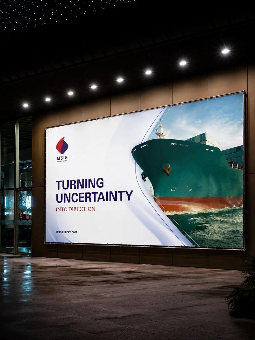
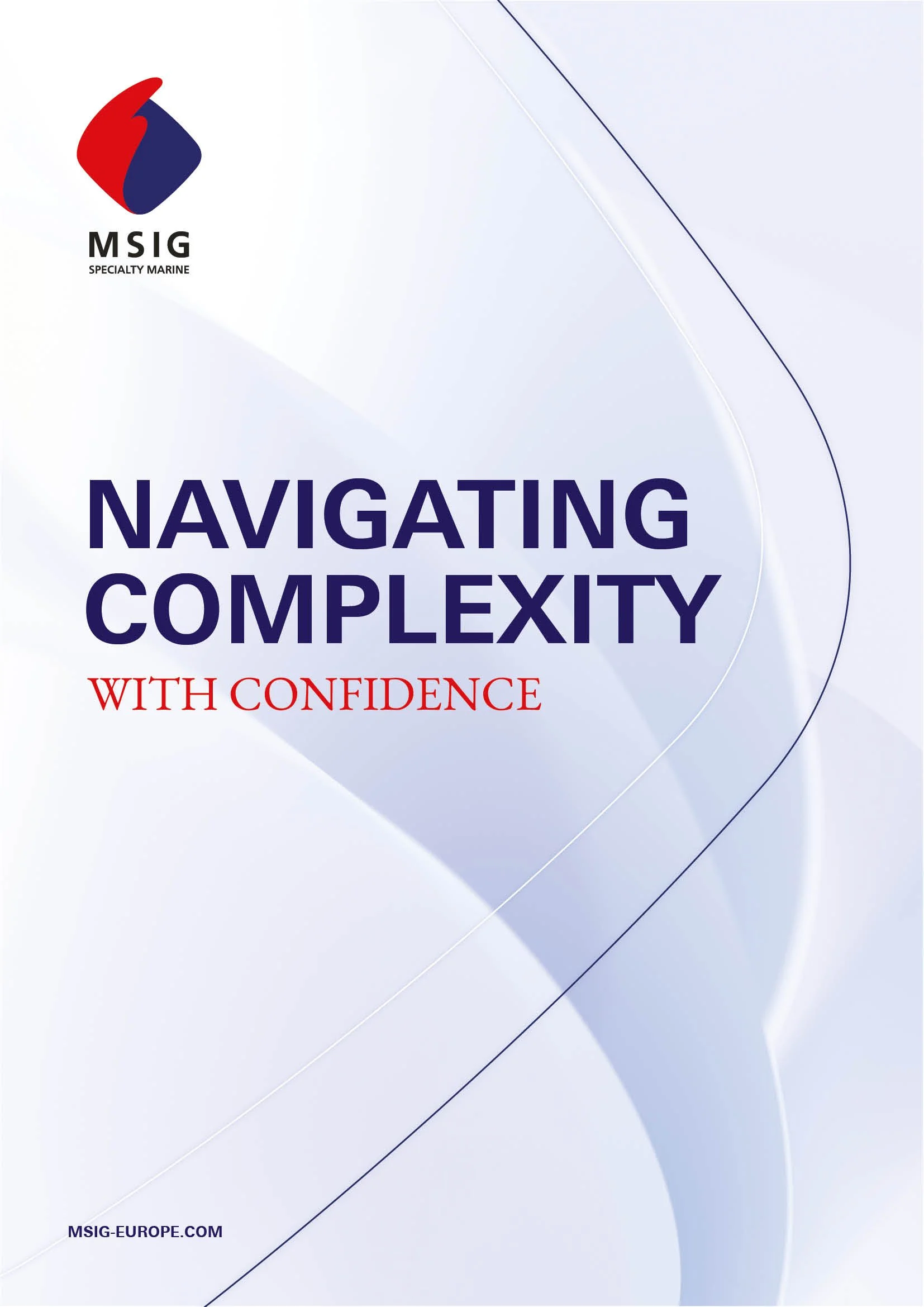
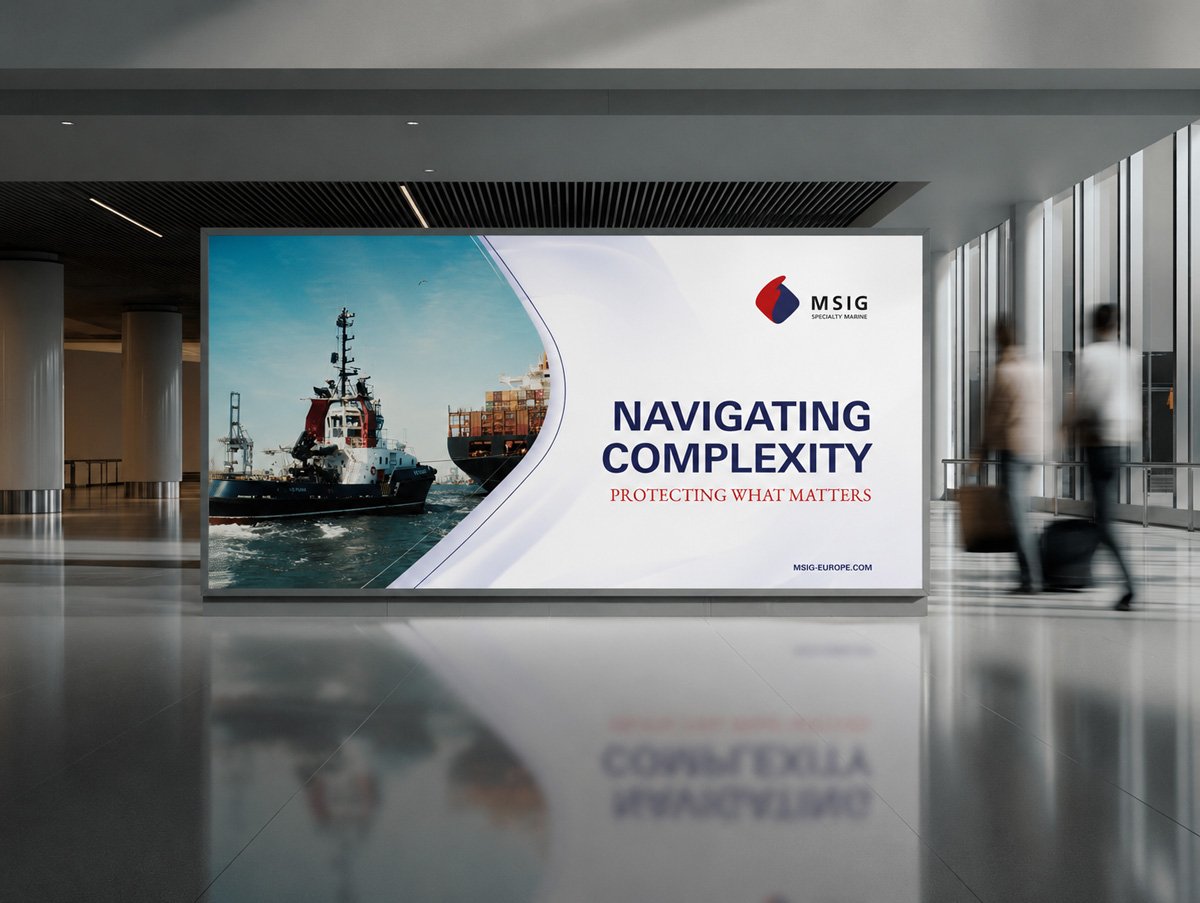
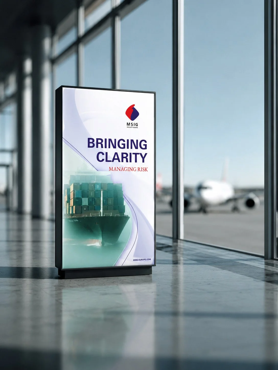
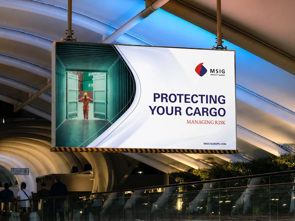
At the core of the strategy was a simple idea: MSIG brings clarity, structure and protection to unpredictable environments.
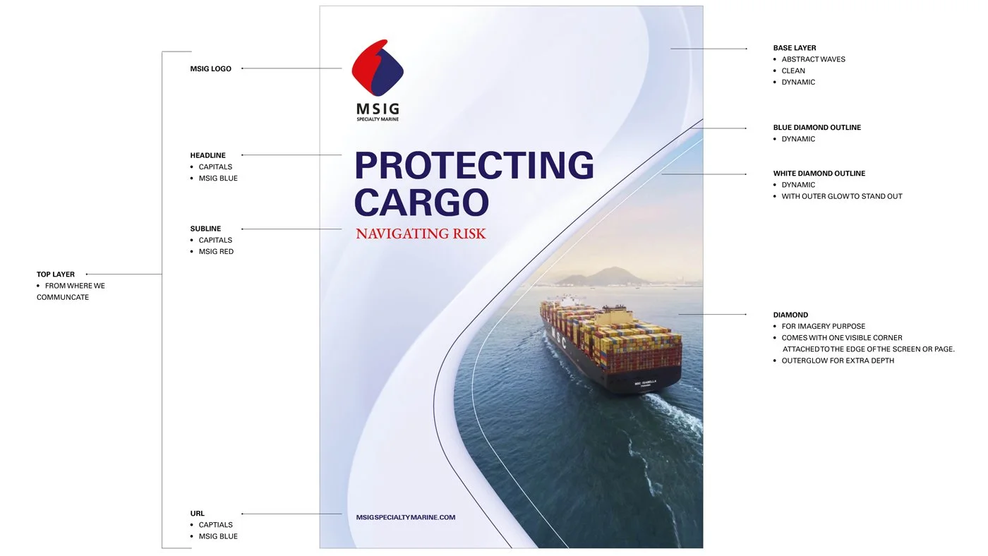
Visual Strategy – Layers of Risk & Protection
The visual identity is built around contrast. A system of two opposing yet connected layers, representing the tension between uncertainty and control.
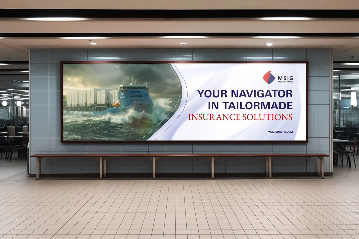
Your navigator in tailormade insurance solutions

In the visual strategy we seek to work with contrast in every visual. A language of layers to the brand. 2 contrasting layers overlaid on one and other, each representing opposing brand qualities.
Together, the base layer and top layer form a cohesive system – calm, purposeful, and connected.

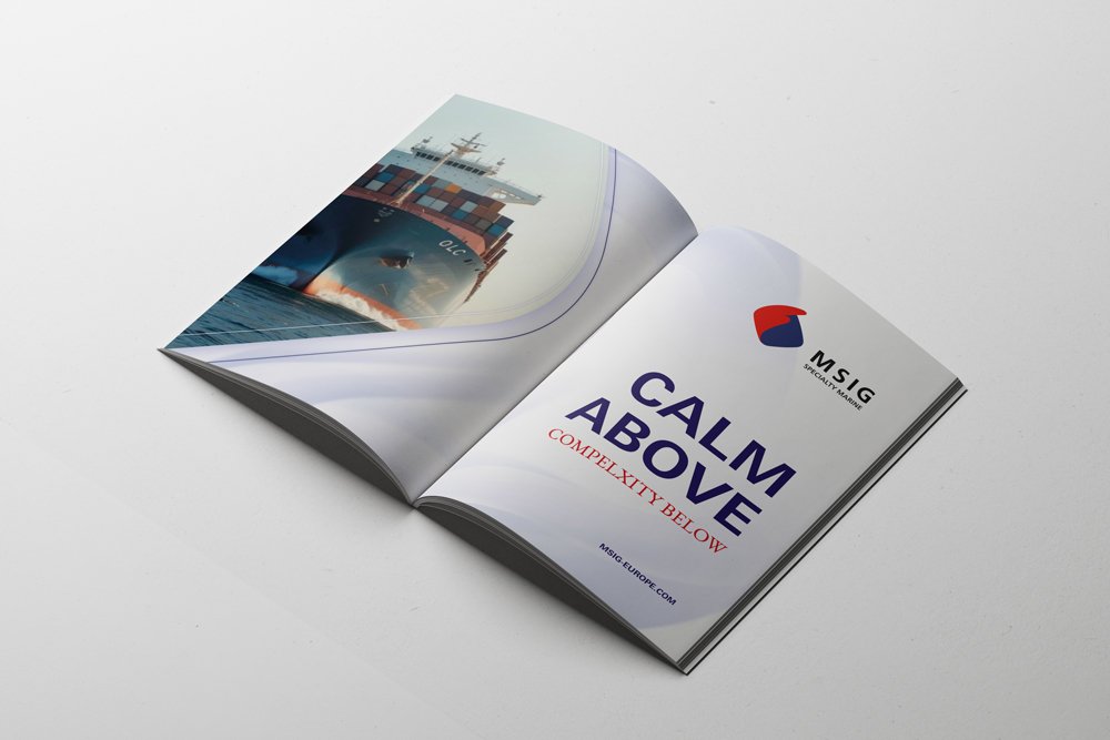
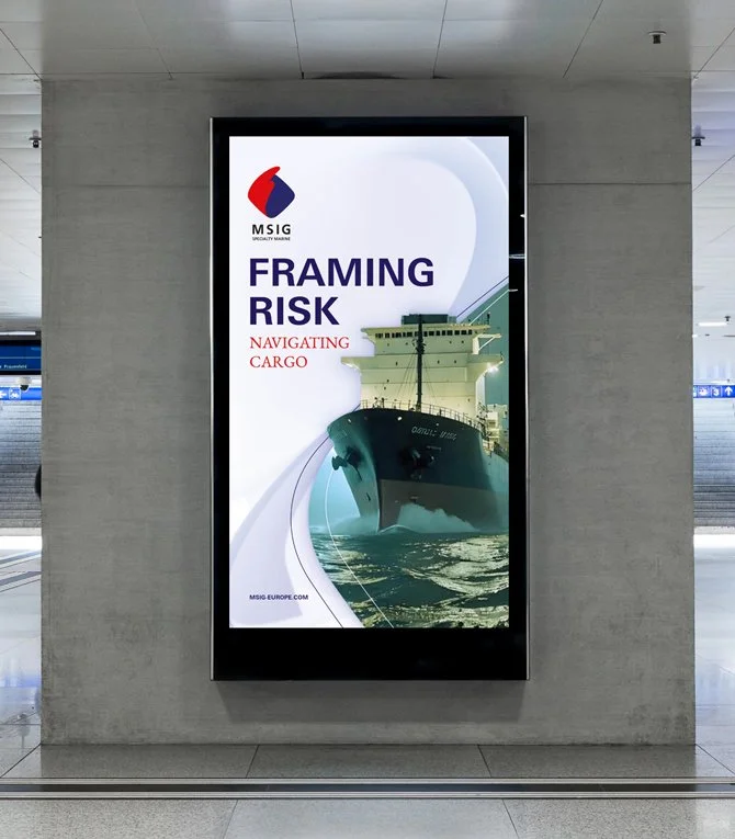
BASE LAYER - What’s below
This layer forms the background. This layer is fluid and dynamic. It shows a world of uncertainty and adventure. A world MSIG Specialty marine is fully equipt to navigate.
TOP LAYER - What’s above
This layer forms a graphical overlay. It is structuredand stable, holding key information. It speaks of heritage and expertise. It may represent control, the safe cargo/ commodities MSIG Specialty Marine works to protect.
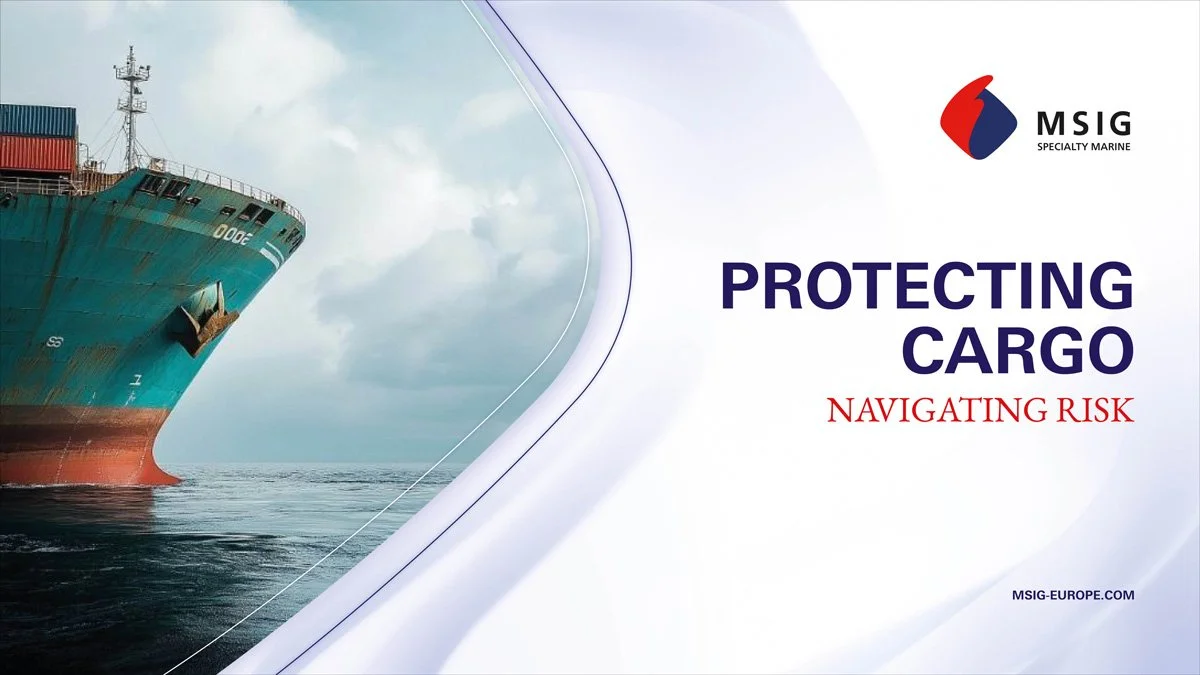
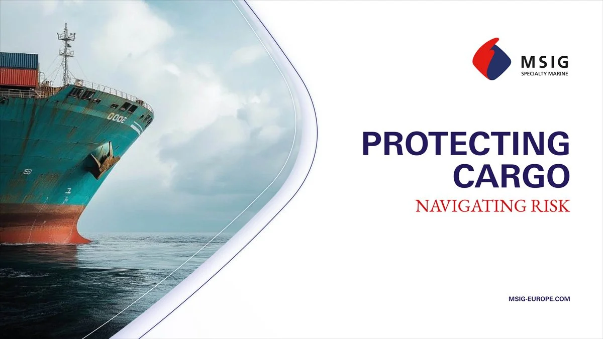
COMBINED LAYERS - As below so above
Together these layers form a rich visual language. Where tradition and modernity/ unpredictability and safety exist in harmony. The base layer responds to the top layer – like a vessel cutting through waves.